

A collapsed timeline demanded efficiency in which QA, DR, VD and UX overlapped but served, to the extent possible, the above model.
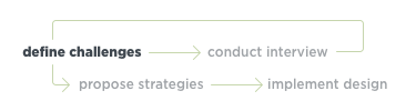
Design Challenges
Markup

I generated a quick QA markup of the existing 'Join Us' page, informing the direction and content of the new design.
Responsiveness
- fixed width site
- mobile-specific URL
Navigation
- header too tall
Information Volume
- a lot of info displayed at once
- expand features discourage reading
Call-to-action emphasis
- expected user action not clear
“If I needed insurance, I just called USAA. Simple as that.”

Strategies
Color
- add a green midway between military and stoplight.
- use palette more widely
Type
- hierarchy, consistency, weight
Visual Paradigm
- dynamic frame
- flagpole as organizing element
Nesting
- give users control over what they see
- drive engagement


Color
Hierarchy
- Implement a consistent hierarchy of typefaces using color as a tool to indicate purpose and importance of copy.
Call-to-Action
- Propose a new richer call-to-action green that doesn’t lose the reference to military green.

